
✌️ Welcome to the latest issue of The Informationist, the newsletter that makes you smarter in just a few minutes each week.
🙌 The Informationist takes one current event or complicated concept and simplifies it for you in bullet points and easy to understand text.
🧠 Sound smart? Feed your brain with weekly issues sent directly to your inbox here
Today’s Bullets:
- What is the Dot Plot?
- Is it accurate?
- How high, how fast?
- And so…?
Inspirational Tweet:
FOMC dot plot revisions revealed big upward ratcheting for the Fed funds rate throughout forecast horizon, following the expected rate boost in 2022. The 4.4% 2022 figure is now followed w/5.1% median in 2023 that reflects an extra half-point hike beyond prior median of 4.6%. pic.twitter.com/p54xoMkvst
— Holger Zschaepitz (@Schuldensuehner) December 14, 2022
If you’ve never seen what we call the Fed Dot Plot before, then this chart and Tweet is a whole bunch o’ gobbledygook to you. But the plot is important when trying to understand the Fed thinking and get into those tiny brains to make sense of their thinking.
So don’t worry, we have you covered here. We’re going to decipher and tackle this and more today, nice and easy…as always.
Let’s get at it.
🟡 What is the Dot Plot?
You all remember the Great Financial Crisis of 2008, and the rise of the Federal Reserve to the front lines of tinkering with monetary policy. Make no mistake, they’ve been heavily involved in manipulating money and its accessibility for decades, but they mostly kept policy tight to their chest and acted as they saw fit, then reported their actions and reasons to the public afterwards.
This changed a bit after the GFC, and in 2012, the Fed introduced what is known as the FOMC Dot Plot. This plot shows where each of the 12 members of the FOMC (the geniuses setting policy within the Fed) expect the Fed Funds Rate to be in the near future.
*Strong Note of Caution: The Fed is not bound by these predictions, and as you will see here shortly, they change their dots more readily than Mr. Bigglesworth’s kitty litter.
But let’s look at the latest plot and acclimate ourselves.
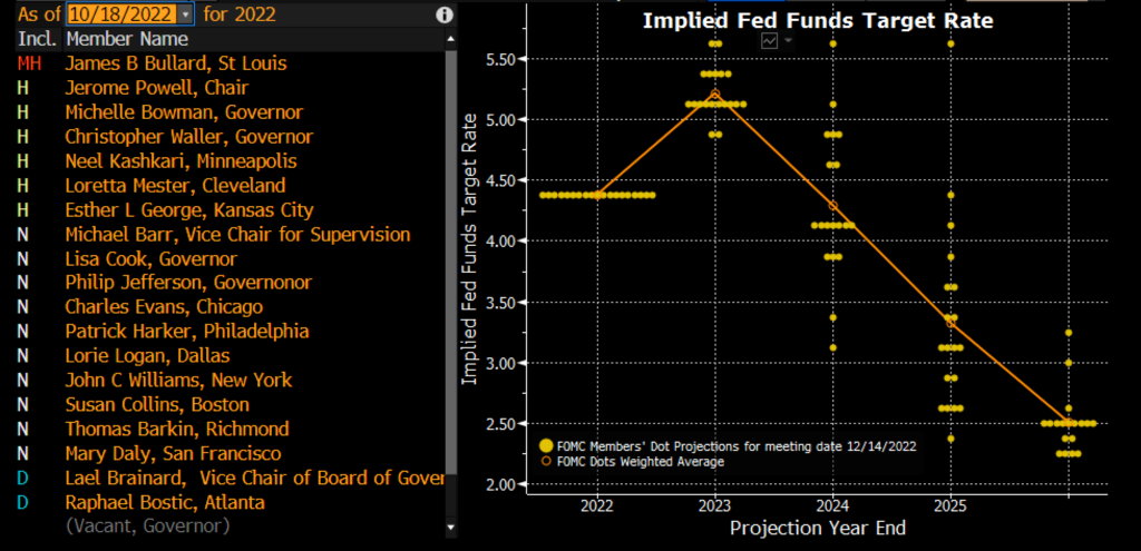
Bloomberg Professional
In this nifty screenshot, we can see all of the current members of the FOMC listed on the left. Of these, eight have permanent votes, and the rest rotate for the last four votes, to total twelve votes at each meeting.
The dots, however, are not votes, but rather the projections of where each of the members expect rates to be in the future. This is why there are more dots at each date than votes that will actually take place.
Looking at 2022, they all lined up to agree that the Fed Funds Rate would end at 4.375%.
Surprise, surprise, that’s where the vote came in and the target range moved up to 4.25 to 4.5%, giving us a median of 4.375%.
Moving to the end of 2023, it appears that seven members expect the rate to be at or above 5.375%, and the other twelve dots below that, giving us a weighted average expected rate of 5.217%.
The dots spread out more in 2024, with the average at 4.296%. They’re spread out even more in 2025, averaging in at 3.322%, and one member expecting the rate to still be up at 5.625%.
This member clearly has not spoken to anyone at the Treasury or read my piece about the debt spiral yet.
Or maybe they just failed high school math.
With some of the comments out of the members lately, this would not surprise me in the least.
Moving on…
🧐 Is it accurate?
To check the accuracy of the dots, let’s pull up the Dot Plot for one year ago today and compare it to the actual Fed Funds Rate this year.
The Dot Plot from 12/15/2021:
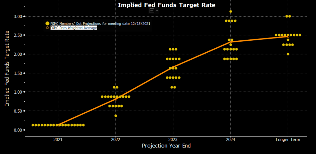
Bloomberg Professional
As you can see here, the FOMC expected rates at the end of 2022 to be at 0.806%, on average. This was back when inflation was a mere glint (or piece of lint) in the eye of the average member of the FOMC. Barely on their radar, so to speak.
And so where did the Fed Funds Rate actually go in 2022?
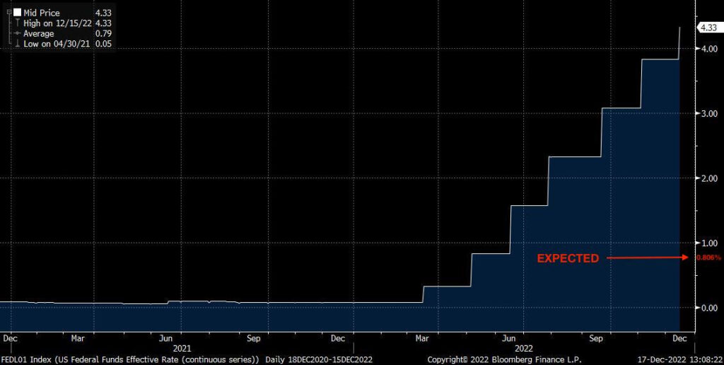
Bloomberg Professional
oops.
Turns out there would be inflation, and no, it was not transitory.
😮 How high, how fast?
Back to deciphering the Fed and using their predictions for our own modeling and investing risk management…
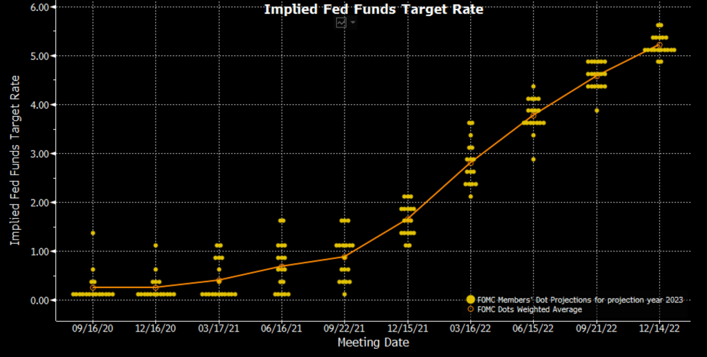
As a result of that annoyingly sticky inflation, the FOMC members have adjusted their expectations quite a bit. Plotting the changes of their expected rate at the end of 2023 from meeting to meeting in the last two years, we see this:
Bloomberg Professional
And so, while back in December of 2021, the members believed that the Fed Funds Rate would be right around 1.5%, if we flash forward one year, we see that the members now believe that at the end of 2023 Fed Funds will be up over 5%. 😮
Amazing what one year will do.
So does that render all expectations and dot plots useless going forward?
Let’s see.
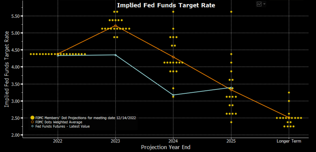
Looking at the latest dot plot from a few days ago, as we said above, we see that the average member believes that rates will end 2023 at 5.217%. But what do the futures show us? The actual traders and investors whose portfolios are impacted by the Fed Funds Rate?
Bloomberg Professional
Represented by that teal line above, it seems traders believe differently.
These people are what we would call ‘invested’ in the outcome of the rates. They will either make or lose money according to their positioning as these rates move.
The FOMC members aren’t actually impacted either way. They could be grossly incompetently wrong (see December, 2021) and have zero impact on their jobs or livelihoods.
At best, just an, oops, sorry ‘bout that, my bad.
At worst, a comment like the one from San Francisco Fed President Mary Daly, “I don’t feel the pain of inflation anymore, because I have enough [money].”
Must be nice all the way up there, Ms. Daly.
So what can we gleam from this? What can we use for our own knowledge and positioning?
Well, we keep hearing and can now see that the Fed is extremely concerned about ongoing inflation. We can expect that they will continue to be extremely concerned until either one of two things happen: the economic data (inflation rate and/or unemployment rate) moves in the direction of showing signs that the economy is slowing at a pace that the Fed believes they can lift their foot off the brake a bit. Pause on the rate hikes, slow down the QT.
Or, the Treasury market could start showing signs of serious stress, lack of liquidity. If you’re wondering what I mean by that, I wrote a whole piece about the Treasury market and liquidity recently that you can find here.
And also what the Fed can do about it here.
Back to the Dot Plot…
And so, looking at the expected rates from the FOMC, we can first extrapolate what we believe the terminal rate to be, which I think is right around 5.25%.
How?
Well, Powell keeps saying they will raise hard and fast to a spot that is sufficient to slow everything enough. And then he indicates that they expect to hold rates there for a while.
He is hell bent on saving his reputation, desperate to be remembered like Volcker.
In any case, this to me indicates rates being raised hard and fast to a spot above 5% and held through the end of the year. Using the average of the dots of 5.217% as a bogey, we get our 5.25% terminal rate. I.e., the highest level that Fed Funds Rate will reach in this cycle.
But are the FOMC members right this time?
Well, looking at the futures market, the investing world believes no.
The investing world indicates that we are about to hit a recession and will then need to lower rates to avoid an outright depression.
Evidence of this is also displayed by the inverted yield curve, which we talked all about in last week’s newsletter. You can find that here.
Bottom line, the markets believe a recession is coming and that rates will need to be lowered in 2023.
Period.
🤨 And so…?
Bringing it all together, looking at the Dot Plots and the futures and the inverted yield curve, I believe we are headed for a pretty tough first quarter in 2023.
The FOMC is clearly expecting to move rates up even more and hold them there for a while. And unless something breaks in the Treasury market, I fully expect them to do this.
I also believe it will ultimately be a mistake.
I believe the futures market is correct, the inverted yield curve is a huge red flag and indication that traders and investors agree. We are headed dead-straight into a recession.
So, I personally am positioned to weather that storm. As I said before, I’m holding cash and opportunistically adding to hard monies, like gold, silver, and Bitcoin. I’m also entering 2023 short the overall market and long the middle of the yield curve. For now.
But that’s me and my situation. Because I’m also watching carefully for signs to reposition my equity exposures to long and add even more to gold, silver, and Bitcoin.
Why?
Because I agree that the Fed is about to make a big mistake. One that will force them to stop raising rates, and by the end of 2023 start lowering again. And if the recession is big enough, the Fed and Treasury will have absolutely no choice but to ultimately start printing money again.
So much, that it will make 2020 look like a mere grocery ATM transaction.
All bets off and money printer go brrrrrr.
That’s it. I hope you feel a little bit smarter knowing about the Fed Dot Plots and how to read and incorporate them into your own investing process.
Before leaving, feel free to respond to this newsletter with questions or future topics of interest. And if you want daily financial insights and commentary, you can always find me on Twitter!
✌️Talk soon,
James